Table of contents
Join our Community!
Oops! Something went wrong while submitting the form.
Stay up to date with the latest insights, trends, and tips for growing your business through referral and loyalty programs. Let's stay connected!


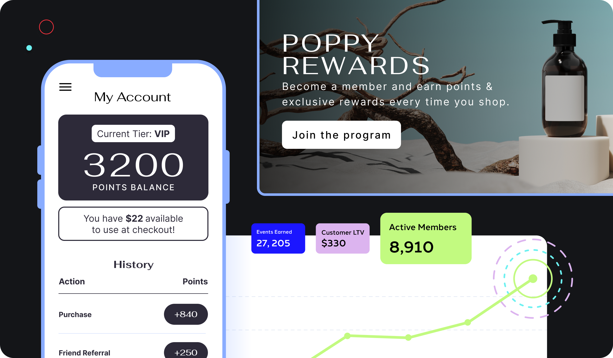
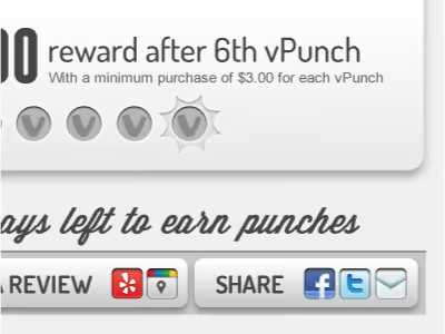
The call-to-action (CTA) button design can be a boon to your social sharing campaigns and customer referral program. Your social lead-generation funnel begins with the button. The initial engagement rate is the absolute genesis of all the metrics that follow.
Here is a short list of what good button design can accomplish:
Learn how to write a call-to-action.
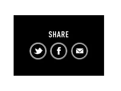
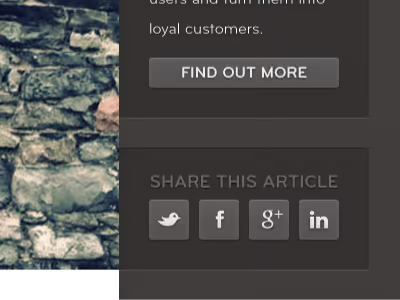
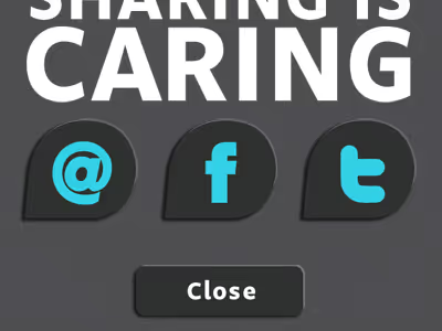
We scoured the web and our own customer's designs to showcase some good examples that will help you get your creative juices flowing. Here are 14 you'll want to check out:
Designer: AltitudeSummit

Site: Blank Label
Designer: @JenBean
Site: CellarThief
Designer: Chase Farnum
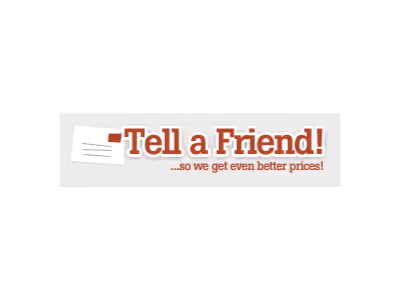
Site: Coastal Contacts
Site: Converse
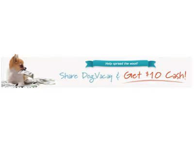
Site: Dog Vacay
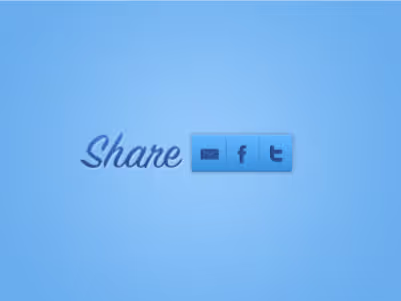
Site: Prismatic
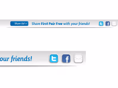
Site: MeUndies
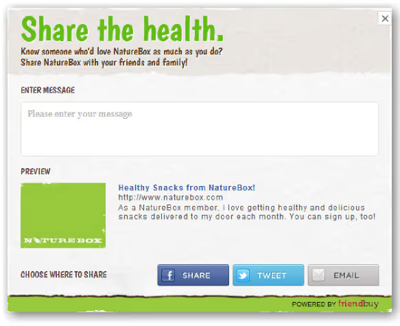
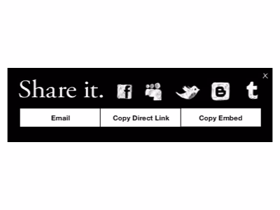
Site: NatureBox
Designer: Ruben Feurer
Designer: Sacha Grief
Designer: Vanessa Torrivilla


.avif)